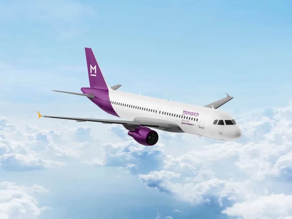
The excitement last week that Monarch Airlines are to return to the sky may have been a little premature, as details of their new look are being gradually released, perhaps with disappointment that they have ditched both the crown of their logo, and their trademark yellow dominant colour, and have adopted a simple text-based logo and the colour purple.
We can only hope that this is the only change they make and that they will retain their trademark service, but now it is looking like the only familiarity is in the name.
The website. https://letsmonarch.co.uk/, explains how they are “working hard to create a brand new Monarch”, despite the fact that most people reacting to the news last week want a return to the old Monarch. The website is now mostly purple, and showcases that bland logo without the crown, which no doubt some marketing company has been paid a fortune to come up with, if normal standards are followed. It does have a line under the letter “M”, so that is probably the result of years at design school paying off for somebody.
Not only that, Airwaysmag exclusively revealed what they say are the new designs for the new Monarch aircraft livery, and again, the crown is gone, as has the yellow, replaced by purple blandness, the picture provided by Monarch Airlines, according to the credit.
Forgive our slightly negative tone, it’s not that we have anything against the colour purple, it is, after all, the colour of emperors in some historic cultures, we just feel somewhat disappointed as for this re-enactment we wanted the familiarity of the Monarch we knew and loved, complete with crown, rather than an emperor.


